Monday 31 August 2009

Super-Outpost-(4)7

I’ve come to gain a new appreciation for the webcomic artist these last 48 hours. Mostly because I’ve spent them drawing Monday’s Star Trax while listening to the Halfpixel crew bang on about comics, their webcomics, other webcomics, stuff related to and otherwise associated with webcomics and, of course, Brad Guigar’s insane-o-laugh. The take home message and, dare I say it, “pro-tip” from me is to take regular breaks to avoid cramp, because I just drew in from outta town and boy is my hand tired. 

Today’s comic review is of a pleasant story-piece by Istaerlus called “Out Post 7”. I’m not really a sci-fi “nut” per se, but I won’t deny that I’ve seen every episode of Star Trek and Stargate SG-1. Ok, so I am a nut, but at least it’s kept respectfully within the confines of two very good series. Now, if I haven’t already made this clear enough, ‘Out Post 7’ is set in an outpost in space. Please do not get confused with an outhouse in space, that’s an entirely different concept and not worth looking into (turns out alien faeces aren’t that different to ours anyway).

Two of the main influences at work with this webcomic are Star Trek: Deep Space Nine (set on a space station) and Babylon-5 (which I’ve never watched). Being the avid Trekston, I’ve recognised several Trek-related things (not least of which was a Ferengi ship) and promptly mentally chastised myself for being such a big fat nerd. The story follows the staff of this outpost as they get a mysterious new recruit called Ghost. The story pretty much pulls you in from the start and, while it’s still early days for the comic, I’m interested in seeing where it’s going. A word of warning to all you humour forward-slash gag-a-day comic followers, do not expect a punch-line in the final panel. This is a graphic novel type of story which involves humour at times, but that is not the main focus.

Everybody’s favourite part of the review, for reader and reviewee alike, is the art part. We like it because it rhymes. Also because we either get to gawk in horrification, point in humiliation or awe at… awesomification. Fortunately for all involved, it’s never really any of those. ‘Out Post 7’ has an art style that reminds me of what Galaxion might have looked like in its early days. It’s got a realism quality to the cartooning, and aliens’ design and what I call “futuristic effects” (like screens lighting up, etc.) are all well presented. 
Story comics should ideally be updated as often as possible to keep the reader hooked, but Out Post 7 adequately relays enough suspense for it to work weekly. The bonus of it being a weekly comic is the amount of time spent on the art and content. You won’t find yourself short-changed, son. 
Character facial expressions are most excellent in this comic. It’s a favourite thing of mine to see descriptive and in-depth expressions and Out Post 7 checks that box with gusto. My only critique is that the hands could do with some work. The trick? Practice, apparently. I’ve watched most of season one, but I’m still not getting any better. The shading, crosshatching and use of shadows is impressive, if a little excessive at times. Like I’ve mentioned already, the “futuristic effects” are exemplary. Honestly, I want to know the secret. Here’s an ample example for you to sample: 
As of today (Monday) there are 15 strips of Out Post 7 for you to sink your wet, gooey eyes into. This should really go without saying when talking about a new webcomic, but I still feel it has to be said. Ignore the detrimental little things like hand drawn speech bubbles and dialogue for the first couple of strips because it very quickly turns into a nice legible typed font with a neat bubble around it. I see this in a lot of new comics and it is in no way a reflection on the quality of the content… Unless the content is crap, obviously. That’s definitely not the case with Out Post 7 and I can see this comic moving from strength to strength in the coming months so it's definitely worth checking out. 
Catch it over on DrunkDuck every Monday at http://www.drunkduck.com/Out_Post_7

Bing bang boom, 3 outta 5 paw-things. 

See you next Monday! 

Peace, 
Coyote Trax

Monday 24 August 2009

Pigs and Such

Hey! We update on Mondays now. Just sayin’. This week, I tragically attempted to sign up for Jobseeker’s Allowance. It’s not as bad (read: profitable) as Unemployment Benefit. But, guy, that Social Welfare office is so depressing! And it’s full of filthy, filthy immigrants. I tried cracking a joke and was met with the most soul-draining stare I’ve ever encountered in my 21 years of life and mooching. It was truly a harrowing experience. And I still haven’t gotten my money, consarnit. 

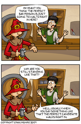
So how did I get over this awful, disheartening occurrence? Webcomics! What were you expecting me to say? Meditation? Don’t be absurd. This week’s new webcomic for your front eyes is called “The Pigs Ear” by Craig Munro (not with an ‘e’) which started back in May. I was taken with this comic for two reasons. One: It is set in a pub and, being Irish, I can thoroughly relate to that. 

The second reason is something that all new webcomic authors should take to heart, and that is to have an interesting premise for your story. It doesn’t have to be fancy or complicated like the start of a Hitchcock movie; it just has to be enough to give the casual reader a reason to come back. 'The Pigs Ear', as mentioned, is set in a pub. Not just any pub though, ladies and gentlemen, it is a magical pub! I’m kidding of course, that’s a stupid premise. The pub is set in one of those mythological lands where ogres roam the tennis courts and princesses scrounge for scraps in the local tabernacle. This makes for a lot of good story angles (read: crazy shenanigans) and a near-limitless set of potential characters. 

The primary setting is the local, where we have our main characters hanging out and drinking like Germans: more or less responsibly. The Barkeep (known only by his job title) maintains order in his domain… Sorry, takes orders in his domain. My bad. His regular is Cyril T. Wizard. Every bar has a regular. Y’know the guy who’s more ‘regular’ than the regulars? Better known as an alcoholic in some circles. Mr. Wizard drives, I’d guesstimate, about 60-70% of the humour overall. This is possibly the only thing I don’t like about the strip. He’s a winner, he never loses. Now I could sit here on my high horse and, smoking a pipe, combing my moustache and launch into a tirade about the evils of the “Mary-Sue” character (think Ethan from Ctrl+Alt+Del) where they represent the author and only good things happen to them. Well, I’m not going to berate the Mary-Sue idea today. For one, I’m not entirely certain it actually applies here. Secondly, Mary-Sues can be pretty good sources of humour and aren’t necessarily a bad thing. They’re just irritating. Like a fly that’s buzzing around while you’re eating dinner and it refuses to go out the window. Then it lands on the butter and starts lording it over you. I hate that fly. 

What in the heck was I talking about? That’s right, the humour. ‘The Pigs Ear’ has a nice general sort of humour despite the quasi-fantasy genre. Really anyone can read this, PG-13 as they say. I found the story arc about finding a bartender assistant most excellent, mostly because it doesn’t centre around Cyril. But that’s just me. You’ll find it twice as funny if you aren’t cursed with the ability to deconstruct a webcomic. Really, I ruin these things for myself because it is funny stuff

Moving briefly onto the artwork now and there isn’t much to say on it. Typical cartoonish style and the characters are reflected very nicely in their illustration. I’m very fond of the shading, it’s truly top notch. And I don’t say “top notch” very often or, indeed, at all. I’m impressed verily by it.
The Pigs Ear’ has found its feet as a comic. The characters are solid, the story is capable of growth, the artwork makes for a lovely read and the humour functions well enough to drive away the Social Welfare Office blues. What more could you ask for? A patented Trax rating? Well, if you insist. I give this puppy a 3.5 out of 5.
It’s worth your time and I can see it moving from strength to strength in the coming years. You can catch it every Thursday at www.pigsearonline.com. By the way, don’t type “pigsareonline” like what I did once. Pigs are online and they do disgusting, filthy things.

Join us next Monday for another thrilling instalment of Coyote Trax’s Webcomics Critique!

Peace.

Saturday 15 August 2009

Bottoms Up!

Hi, welcome back. This title works well for two reasons. The first is thus: We’re back! Woo! To review and ridicule all that is new in webcomics. It is a time for celebration. Hope you didn’t miss me too much. (So what if I'm that egotistical?  It makes me an even better person.)

The second reason “Bottoms Up!” makes for a good title to this review is pretty obvious. It is the title to this week’s review-o-comic by Brian O’Meara (it is always fantastic to see an Irish name in webcomic land, even if many of those are strange Americans who call themselves Irish though they have never been and it was, in fact, their great-great-grandfather who happened to once spend thirty-five minutes there as a ship pulled into a dock - But it was a magical experience that touched his heart nonetheless.) But I digress back to our comic of the day. 

I first started reading ‘Bottoms Up!’ because it appealed to my love of simple, single-panel newspaper comics. You know the ones I mean. They’re plain black and white, great use of cross-hatching and that sort of thing, yeah? Well ‘Bottoms Up!’ isn’t a far cry from that. It makes use of the black and white style with shading that will honestly blow you away. Physically, it couldn’t be more accurate and appropriately used, giving the drawings a decent sense of life. This is important, folks. If you’re drawing a comic, you really have to make the characters look alive. Nobody likes to eat a rice cake on its own. You gotta put some chocolate or peanut butter on that blank slate and give it some taste so the wholesome goodness of the rice can work its magic on your digestion. Cakin’. On a more general note, there’s a danger with the use of shading, specifically over-use, which can cause the comic to look crap. Characters meld into backgrounds and lose their definition. Truly it is a sad state of affairs when you see one of these comics. It’s like the artist thought that to be truly good, they had to smudge every single pencil line to create the shading effect, throwing caution to the sewers in terms of where the light source is or where the shadows would be cast.
Here’s a taste of what I be speakin’, Jethro. 


Let’s get back to ‘Bottoms Up!’ though. Despite the great artwork and highly commendable use of shading, the humour is about par. In fairness, single panel comics are tricky things. You have one panel to build a joke, set-up and punch-line. A lot of comics out there rely on three or four panels, and occasionally five, in order to hook that up, but because of this they have a greater diversity in terms of what they can accomplish with their humour. A pregnant pause is a good tool when not over-used. You try putting that into a single panel comic and you’ve got nothing. Literally. ‘Bottoms Up!’ therefore takes the road that most single-panels do. Observational humour. It’s solid material that most people can relate to, usually office-type humour or general life humour. Though there’s definitely a more saucy “Ooh, Matron!” approach to some of them, but it’s no less funny. Sadly, it’s no funnier either. The best strips within are those with captions. The captions make the funny. The art is there for the visual, but the captions make it. There are a couple (literally two, I think) without captions where the character is just saying something, usually a bad pun, and the strip falls flat. 
If you compare to the single panel works of Saturday Morning Breakfast Cereal back in the day, you can see the reliance and, effectively, the need for the caption. Though SMBC is more ‘out there’ with its style while ‘Bottoms Up!’ is purely observational.  

I’m giving ‘Bottoms Up!’ a 3.5 outta 5. The artwork brings it up nicely, but if I’m honest, this style belongs in a printed format. While it works on the web, and should remain here where it’s safe and warm, it’s probably a tad “raunchy” for the newspapers (it’s actually not that raunchy, but newspaper people are dicks when it comes to that). Actually, a men’s magazine might be more suited. Nothing too brash, like 'Nuts' or 'Zoo', but something more motor-vehicle based. Men aged 24-50 would get this type of humour best, and most aren't reknowned for their interweb skillz.  

Bottoms Up!’ updates Monday/Wednesday/Friday. Read it with your eyes at http://www.bottomsupcomic.com

Peace and chicken grease,
Coyote Trax